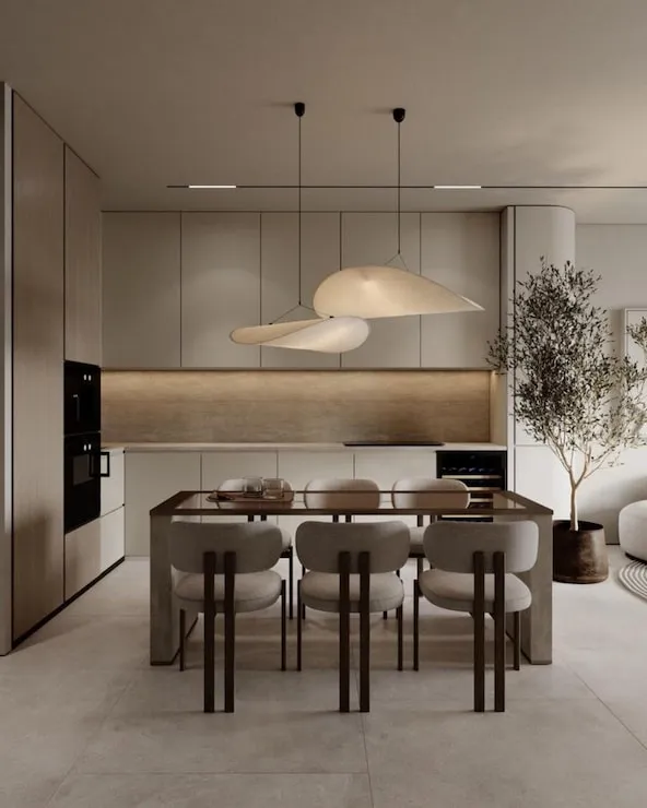

A convincing render is often treated as the final flourish of a design project, but most of its quality is decided much earlier. Camera position, material logic, furniture scale, daylight direction, and the level of detail in the underlying model all shape the result before any rendering begins. That is why interior design rendering is not simply a matter of choosing a powerful tool. A weak scene with no clear visual idea will still look weak, even if the software produces it quickly.
The opposite is also true. A fairly simple scene can communicate beautifully when the designer knows what the image needs to say. Perhaps the purpose is to show how morning light reaches the kitchen table. Perhaps it is to help a client understand the relationship between dark joinery and pale stone. When the purpose is clear, every choice in the image, including what gets left out, becomes easier to judge.
Choose the View Before You Chase Detail
A camera angle can make or break an interior image. Wide views show relationships but can exaggerate depth. Tighter views feel more intimate but may hide circulation or context. Before adding accessories or perfecting textures, it is worth testing a few simple camera positions. A grey model with basic lighting is often enough to reveal whether the composition feels balanced and whether the important parts of the room are actually visible.
The same principle applies when comparing interior rendering software. Features matter, but a tool is only useful if the designer can reach a clear view without fighting the interface. Fast previewing, easy camera control, and the ability to work from existing model exports or images may matter more in daily practice than a long list of technical options that the studio rarely uses.
Materials Need Relationships, Not Just Realism
A texture can look photorealistic on its own and still feel wrong in the room. Real materials are read in relation to one another. Glossy stone next to matte plaster behaves differently from glossy stone beside lacquered joinery. Warm timber can look orange under one light and almost neutral under another. A good render does not simply make each surface realistic; it makes the material story believable as a whole.
This is why quick material testing can be useful early in the process. Rather than perfecting a single finish, a designer can compare a few families of options and see how they react to the rest of the palette. Once the direction is settled, the detailed work becomes more focused. The team is refining a decision instead of trying to discover the decision inside a finished image.
Lighting Should Explain the Space
Interior lighting is easy to overdramatize. Strong shafts of sunlight, glowing coves, and moody pools of light can make an image impressive, but they may not represent how the room will normally feel. The best lighting choice depends on the question being asked. A hospitality concept might benefit from an evening scene. A family kitchen may need to be shown in ordinary daylight because that is when the client will use it most.
It helps to treat light as information. Where does it come from? What does it reveal? Which surfaces need to read clearly? If the answer is “everything,” the image may end up flat. If the lighting only serves drama, important design relationships may disappear. A believable render usually has a hierarchy: some areas lead the eye, some support them, and a few are allowed to stay quiet.
Do Not Style Away the Architecture
Accessories can make a render feel lived in, but they can also hide weak design. When every surface is covered with books, ceramics, flowers, cushions, and artwork, clients may respond to the styling rather than the room. It is useful to review a scene once with minimal decoration. Does the architecture still feel resolved? Are the proportions convincing? Does the material contrast hold up without decorative help?
AI-assisted tools can make styling very easy, which makes restraint even more important. dsgnr can help users explore visual directions from models, sketches, photos, or references, but the designer still decides what the image should emphasize. A few well-chosen objects can establish scale and use. Twenty decorative objects can turn a design review into a discussion about props.
Render for the Stage the Project Is In
Not every project stage needs the same level of finish. During concept development, a fast image may be enough to settle the palette. During client approval, the team may need a more coherent room with recognizable furniture and lighting. Marketing or competition images may justify another level of polish again. Matching effort to the stage prevents studios from spending presentation time before the design has earned it.
This also helps manage expectations. Labeling a visual as a concept study signals that products and details may change. A later presentation image can be more specific because the scheme has been checked. That simple distinction reduces the risk of a client becoming attached to an element that was only added to make an early image readable.
Review the Image at Normal Viewing Size
Rendering teams often inspect images zoomed in because they are looking for texture problems, rough edges, or small artifacts. Clients usually see the same image on a laptop screen, in a presentation, or briefly on a phone. Before spending another hour on tiny details, it helps to review the render at the size it will actually be seen. Problems with composition, contrast, and hierarchy become much more obvious, while many microscopic imperfections stop mattering.
This simple check is useful for deciding where to spend the final effort. If the eye goes to the wrong corner, adjust the light or composition. If the material distinction disappears at presentation size, strengthen it. If a tiny object is barely visible, perfecting it may not improve the communication at all. Good rendering is partly about knowing what deserves attention and what can remain quietly imperfect.
Conclusion
Good interior rendering begins with design intent, not rendering settings. A clear camera, a believable material relationship, purposeful lighting, and the right level of detail will do more for an image than technical polish added at the end. Software can speed up the process, but it cannot decide what the image is supposed to communicate.
The strongest workflow treats rendering as part of design thinking. Early images answer questions. Later images confirm choices and help other people understand the space. When the team knows which stage it is in, the render becomes more than decoration. It becomes a practical tool for making and communicating better interior decisions.